
Search
There are 10 results.
Tag
Tag
All (39)
Active Learning (1)
Alt Text (2)
Analytics (3)
Assessments (1)
Belonging (1)
Canvas (3)
Case Studies (1)
Collaboration (1)
Color Contrast (2)
Communication (4)
Community (3)
Content Creation (2)
Course Materials (1)
Course Preparation (1)
Discussions (3)
Diversity (1)
Equity (1)
Images (1)
Inclusion (2)
Inclusive Language (1)
Infographics (1)
Multimodality (1)
Page Design (1)
PowerPoint (2)
Presentations (1)
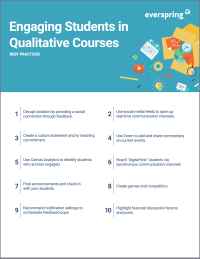
Qualitative courses (1)
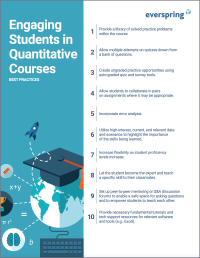
Quantitative courses (1)
Representation (1)
Rubrics (1)
Social Media (2)
Spreadsheets (1)
Synchrony (1)
Third-Party Tools (1)
UDL (1)
Video (4)
Visual Accessibility (1)
Visual Design (1)
Format
Representation in Course Images

How many times have you looked at an image and thought, “Have I seen this before?” Chances are, if you are browsing a stock photo site, it’s often. That feeling of déjà vu occurs because images reflect an amalgam of artistic, cultural, and ideological influences (Hall, 2015).
Improving PowerPoints

Sharing information via PowerPoint presentations is a long-established strategy in higher education. Designing PowerPoint presentations for online courses can pose unique challenges; however, best practices can help overcome these hurdles. With time and attention, faculty and instructional designers can create engaging and purposeful presentations with lasting value.
Using PowerPoint in a Video

The familiarity and ease of PowerPoint make it a natural choice for creating instructional videos. After all, your energy is better spent on planning and recording videos than on learning a new tool. However, creating quality slides still requires significant time and attention to detail.
Leveraging White Space

Good page design requires balance between white space, or negative space, and positive space. Positive space encompasses all aspects and types of content; on a course page, these objects might include an introductory paragraph, video thumbnail, infographic, callout box, opinion poll, or provocative quotation. Relative to these course components, white space might seem like a nice-to-have. Because it promotes clarity and reduces distortion, however, white space is just as important to instructional page design as content.
LMS Analytics: Supporting Your Students With Data

With the help of tools like Canvas New Analytics, faculty can leverage learning management system (LMS) data to hone their instructional techniques and improve their online students' experience. In this piece, we provide an introduction to learning analytics in online higher education and detail some analytics best practices.
Navigating Canvas New Analytics

At the end of 2019, Canvas rolled out New Analytics, a new version of their former analytics tool, Course Analytics. By Canvas' own description, New Analytics retains the core functionality of Course Analytics while offering a simplified user experience. In this post we share our recommendations for leveraging New Analytics to support students.
Accessible Use of Color

Some students (older learners, learners with partial sight, learners with colorblindness, and learners using monochrome or text-only displays) have difficulty perceiving color. To ensure that course content is perceivable to all learners, you should follow guidelines for color use that have been established by the World Wide Web Consortium (W3C), the organization responsible for international standards of web accessibility, including the Web Content Accessibility Guidelines (WCAG). Three essential WCAG requirements, known as success criteria, are summarized below.
Accessible Use of Text

Students with diverse cognitive, linguistic, and academic abilities benefit from accessible text. The Web Content Accessibility Guidelines (WCAG) establish numerous requirements (known as success criteria) to ensure that text is perceivable, operable, and understandable to all users. This guide synthesizes the essential criteria related to text accessibility. Following these guidelines when creating course content, such as documents, slides, and pages in the LMS, will help you eliminate potential barriers for your learners.