
Search
There are 8 results.
Tag
Tag
All (39)
Active Learning (1)
Alt Text (2)
Analytics (3)
Assessments (1)
Belonging (1)
Canvas (3)
Case Studies (1)
Collaboration (1)
Color Contrast (2)
Communication (4)
Community (3)
Content Creation (2)
Course Materials (1)
Course Preparation (1)
Discussions (3)
Diversity (1)
Equity (1)
Images (1)
Inclusion (2)
Inclusive Language (1)
Infographics (1)
Multimodality (1)
Page Design (1)
PowerPoint (2)
Presentations (1)
Qualitative courses (1)
Quantitative courses (1)
Representation (1)
Rubrics (1)
Social Media (2)
Spreadsheets (1)
Synchrony (1)
Third-Party Tools (1)
UDL (1)
Video (4)
Visual Accessibility (1)
Visual Design (1)
Format
Format
Blog (8)
Improving PowerPoints

Sharing information via PowerPoint presentations is a long-established strategy in higher education. Designing PowerPoint presentations for online courses can pose unique challenges; however, best practices can help overcome these hurdles. With time and attention, faculty and instructional designers can create engaging and purposeful presentations with lasting value.
Spreadsheet Accessibility
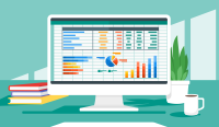
Spreadsheets are used for a broad array of data-related tasks and projects across numerous disciplines. Maximizing the utility of spreadsheets included as course materials requires careful attention towards their contents and formatting. In this post, we present recommendations for enhancing the clarity, consistency, and accessibility of course spreadsheets for students.
Using PowerPoint in a Video

The familiarity and ease of PowerPoint make it a natural choice for creating instructional videos. After all, your energy is better spent on planning and recording videos than on learning a new tool. However, creating quality slides still requires significant time and attention to detail.
Infographic Considerations
An infographic is a visual that combines text, graphics, diagrams, and graphs to present information. When used effectively, infographics can be a powerful tool to guide students through the learning process. “Infographics ask for an active response from the viewer, raising the questions, ‘What am I seeing?’ and ‘What does it mean?’” (Krauss, 2012, p. 10). Infographics also present information in an organized way, which can improve students’ critical thinking, analysis, and synthesis skills (Yildirim, 2016).
LMS Analytics: Supporting Your Students With Data

With the help of tools like Canvas New Analytics, faculty can leverage learning management system (LMS) data to hone their instructional techniques and improve their online students' experience. In this piece, we provide an introduction to learning analytics in online higher education and detail some analytics best practices.
Navigating Canvas New Analytics

At the end of 2019, Canvas rolled out New Analytics, a new version of their former analytics tool, Course Analytics. By Canvas' own description, New Analytics retains the core functionality of Course Analytics while offering a simplified user experience. In this post we share our recommendations for leveraging New Analytics to support students.
Zoom Into Online Learning

Faculty often express concern over how to maintain personal relationships with their students in an online course space; incorporating optional synchronous elements to an online course can help “put a face” to a name. Zoom, the video conferencing tool that allows you to create synchronous experiences for their students, has become ubiquitous in educational and businesses in the past two years.