
Search
There are 13 results.
Tag
Tag
All (69)
Active Learning (1)
Activities (3)
Alt Text (2)
Analytics (4)
Assessments (3)
Asynchrony (1)
Belonging (1)
Canvas (8)
Case Studies (1)
Collaboration (4)
Color Contrast (2)
Communication (6)
Community (5)
Content Creation (6)
Course Maintenance (4)
Course Materials (4)
Course Preparation (3)
Discussions (4)
Diversity (1)
Equity (1)
Faculty Presence (1)
Feedback (2)
Grading (3)
Hyperlinks (1)
Images (1)
Inclusion (3)
Inclusive Language (1)
Infographics (1)
Learning Objectives (1)
Multimodality (2)
Page Design (1)
Peer Review (1)
PowerPoint (2)
Presentations (1)
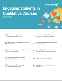
Qualitative courses (1)
Quantitative courses (1)
Representation (1)
Revising (2)
Rubrics (3)
Screen Readers (1)
Social Media (2)
Spreadsheets (1)
Synchrony (3)
Third-Party Tools (1)
UDL (1)
Video (7)
Visual Accessibility (2)
Visual Design (1)
Workload (1)
Format
Spreadsheet Accessibility

Spreadsheets are used for a broad array of data-related tasks and projects across numerous disciplines. Maximizing the utility of spreadsheets included as course materials requires careful attention towards their contents and formatting. In this post, we present recommendations for enhancing the clarity, consistency, and accessibility of course spreadsheets for students.
Instructor Presence in Online Courses

Consistent and meaningful instructor presence is one of the most important drivers of student success and satisfaction in online courses (Roddy et al., 2017). However, establishing instructor presence online can be challenging. In fact, studies have shown that many online students feel their instructors are largely invisible (Tichavsky et al., 2015).
Updating Your Syllabus

Over time, you may want to make changes to the syllabus of a course. The syllabus documents are saved in the “Files” area (1) of the course. To preserve the integrity of the document, the Word document is located in the “Instructor Only” folder (3) and the PDF is found in the “Documents” folder (2) so it is visible to students.
Editing Links and Rubrics from Other Courses

Situations may present themselves in which links or rubrics from another course can be useful in a current course. Should this occur, rubrics from other courses can be uploaded into another course. To successfully insert a previously built rubric, please follow the following steps.
Improving PowerPoints

Sharing information via PowerPoint presentations is a long-established strategy in higher education. Designing PowerPoint presentations for online courses can pose unique challenges; however, best practices can help overcome these hurdles. With time and attention, faculty and instructional designers can create engaging and purposeful presentations with lasting value.
Representation in Course Images

How many times have you looked at an image and thought, “Have I seen this before?” Chances are, if you are browsing a stock photo site, it’s often. That feeling of déjà vu occurs because images reflect an amalgam of artistic, cultural, and ideological influences (Hall, 2015).
Infographic Considerations

An infographic is a visual that combines text, graphics, diagrams, and graphs to present information. When used effectively, infographics can be a powerful tool to guide students through the learning process. “Infographics ask for an active response from the viewer, raising the questions, ‘What am I seeing?’ and ‘What does it mean?’” (Krauss, 2012, p. 10). Infographics also present information in an organized way, which can improve students’ critical thinking, analysis, and synthesis skills (Yildirim, 2016).
Navigating Canvas New Analytics

At the end of 2019, Canvas rolled out New Analytics, a new version of their former analytics tool, Course Analytics. By Canvas' own description, New Analytics retains the core functionality of Course Analytics while offering a simplified user experience. In this post we share our recommendations for leveraging New Analytics to support students.
LMS Analytics: Supporting Your Students With Data

With the help of tools like Canvas New Analytics, faculty can leverage learning management system (LMS) data to hone their instructional techniques and improve their online students' experience. In this piece, we provide an introduction to learning analytics in online higher education and detail some analytics best practices.