
Search
There are 7 results.
Tag
Tag
All (28)
Active Learning (1)
Analytics (1)
Animations (1)
Assessments (2)
Asynchrony (3)
Canvas (1)
Collaboration (2)
Communication (3)
Content Creation (1)
Content Curation (1)
Content Delivery (1)
Copyright (1)
Course Materials (1)
Course Preparation (2)
Discussions (1)
Diversity (1)
Feedback (1)
Images (1)
Inclusion (1)
Infographics (2)
Learning Objectives (1)
Multimodality (3)
Page Design (1)
Podcasts (1)
PowerPoint (2)
Presentations (1)
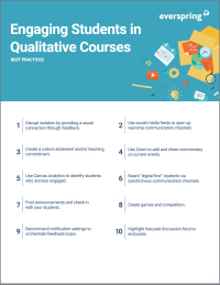
Qualitative courses (1)
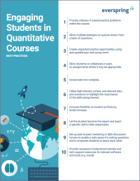
Quantitative courses (1)
Representation (1)
Social Media (1)
Spreadsheets (1)
Summative Assessments (1)
Synchrony (4)
Third-Party Tools (1)
UDL (1)
Video (5)
Visual Accessibility (1)
Visual Design (1)
Format
Spreadsheet Accessibility

Spreadsheets are used for a broad array of data-related tasks and projects across numerous disciplines. Maximizing the utility of spreadsheets included as course materials requires careful attention towards their contents and formatting. In this post, we present recommendations for enhancing the clarity, consistency, and accessibility of course spreadsheets for students.
Improving PowerPoints

Sharing information via PowerPoint presentations is a long-established strategy in higher education. Designing PowerPoint presentations for online courses can pose unique challenges; however, best practices can help overcome these hurdles. With time and attention, faculty and instructional designers can create engaging and purposeful presentations with lasting value.
Using PowerPoint in a Video

The familiarity and ease of PowerPoint make it a natural choice for creating instructional videos. After all, your energy is better spent on planning and recording videos than on learning a new tool. However, creating quality slides still requires significant time and attention to detail.
Using Hotspots

A unique way to share information, images with hotspots offer online learners the opportunity to interact with course content. Learners can click or hover on particular parts of an image and receive pop-ups giving them more information. Hotspots represent information in a particular context; thus, they fulfill the multimedia principle—use words and graphics rather than words alone—and the contiguity principle—align words to corresponding graphics (Clark & Mayer, 2016).
Representation in Course Images

How many times have you looked at an image and thought, “Have I seen this before?” Chances are, if you are browsing a stock photo site, it’s often. That feeling of déjà vu occurs because images reflect an amalgam of artistic, cultural, and ideological influences (Hall, 2015).