Search
There are 53 results.
Category
Tag
Tag
All (124)
Active Learning (4)
Activities (4)
Alt Text (2)
Analytics (4)
Animations (1)
Assessments (7)
Asynchrony (6)
Authentic Activities (2)
Backwards Design (2)
Belonging (3)
Canvas (10)
Case Studies (2)
Collaboration (5)
Color Contrast (2)
Communication (8)
Community (7)
Content Creation (12)
Copyright (2)
Course Maintenance (5)
Course Materials (7)
Course Preparation (6)
Discussions (5)
Diversity (5)
Equity (2)
Faculty Presence (3)
Faculty Support (2)
Feedback (8)
Formative Assessments (6)
Game-Based Learning (2)
Gamification (1)
Generative AI (2)
Grading (5)
Group Work (2)
Hyperlinks (1)
Images (3)
Inclusion (6)
Infographics (2)
Learning Objectives (3)
Multimodality (7)
Page Design (2)
Peer Review (1)
Podcasts (1)
PowerPoint (2)
Presentations (2)
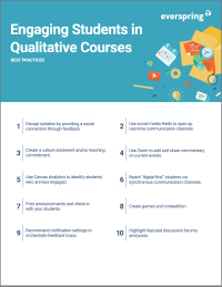
Qualitative courses (1)
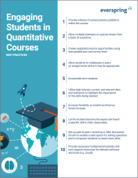
Quantitative courses (1)
Representation (1)
Revising (2)
Rubrics (4)
Scaffolding (1)
Screen Readers (1)
Social Media (2)
Summative Assessments (1)
Synchrony (8)
Third-Party Tools (2)
Universal Design for Learning (UDL) (2)
Video (12)
Visual Accessibility (2)
Visual Design (2)
Workload (1)
Written Assignments (1)
No Sweat Alt Text
What is “alt text”? Alt text is descriptive text linked to an image, graph, or other visual content that allows users to understand the visual without viewing it. Any image online should contain alt text, but guidelines differ depending on whether the image is simply decorative or related to other content on the page.
Rubrics as a Tool to Support Equity and Inclusion
While student populations have become increasingly diverse, many groups, including first-generation, non-native English speakers, and individuals with disabilities, still face barriers and bias that can derail their success in college (Super et al., 2020). Traditional grading practices—including penalties for late work, writing in dialects other than standard English, and even plagiarism— are prone to bias and only perpetuate disparities, the research says (Feldman, 2019; Savini, 2021).
Inclusive Texts
Today’s students are diverse and include marginalized groups that have historically been excluded from mainstream education (Ladson-Billings, 2013). In 2021, students of color comprised upwards of 40% of the 15.4 million undergraduates enrolled in U.S. colleges and universities (Nam, 2023; National Center for Education Statistics, 2023). Gloria Ladson-Billings, whose work centers on culturally relevant pedagogy, argues that diverse students require inclusive learning to succeed. “[These students] do not fit neatly into the rigid categories of race, class, gender, or national origin” upon which hierarchies of the past have been built (Ladson-Billings, 2013, p. 5), so authentic representation of diversity in higher education is critical. Adrienne Keene, an assistant professor of American Studies at Brown University, writes that instructors can do their part to support underrepresented students by being honest about their own bias and blind spots, critiquing their course materials, and integrating meaningful representations of diversity into the curriculum (Fuchs et al., 2020; Keene, 2015).
Leveraging White Space
Good page design requires balance between white space, or negative space, and positive space. Positive space encompasses all aspects and types of content; on a course page, these objects might include an introductory paragraph, video thumbnail, infographic, callout box, opinion poll, or provocative quotation. Relative to these course components, white space might seem like a nice-to-have. Because it promotes clarity and reduces distortion, however, white space is just as important to instructional page design as content.
Enhancing Student Learning Through Course Consistency and Accessibility
Course developers (those who build individual courses) play a crucial role in the success of an online degree program by providing expertise and bringing unique perspectives. Accordingly, it is valuable for faculty to customize their course spaces by infusing them with their own knowledge and personality. At the same time, it is also crucial to prioritize structural consistency within and across courses in an online program, as course consistency is a key aspect of accessibility and a key contributing factor to student success. In particular, students must be able to perceive, operate, and understand the course and course materials using program-standard devices and certain assistive technologies, and this should be true across all of the courses in a program. This is where program chairs and administrators can help support faculty in standardizing key elements of courses to facilitate a seamless student experience. In this piece, we discuss how maintaining structural consistency within and across courses can positively impact accessibility.
LMS Analytics: Supporting Your Students With Data
With the help of tools like Canvas New Analytics, faculty can leverage learning management system (LMS) data to hone their instructional techniques and improve their online students' experience. In this piece, we provide an introduction to learning analytics in online higher education and detail some analytics best practices.
Navigating Canvas New Analytics
At the end of 2019, Canvas rolled out New Analytics, a new version of their former analytics tool, Course Analytics. By Canvas' own description, New Analytics retains the core functionality of Course Analytics while offering a simplified user experience. In this post we share our recommendations for leveraging New Analytics to support students.
Taking Stock at the Midpoint of the Term
Halfway through the term isn't a great time to change around a bunch of materials or assignments in your course. However, it is a useful moment to evaluate how the course is going, realign to match the goals you set out at the beginning of the term, and determine what you may be able to tweak to make your course work more effectively for you and for your students. This piece suggests actions you can take at midterm to help shape the second half of the course.


