Search
There are 37 results.
Category
Tag
Tag
All (125)
Active Learning (4)
Activities (4)
Alt Text (2)
Analytics (4)
Animations (1)
Assessments (7)
Asynchrony (6)
Authentic Activities (2)
Backwards Design (2)
Belonging (3)
Canvas (10)
Case Studies (2)
Collaboration (5)
Color Contrast (2)
Communication (9)
Community (7)
Content Creation (12)
Copyright (2)
Course Maintenance (5)
Course Materials (7)
Course Preparation (6)
Discussions (5)
Diversity (5)
Equity (2)
Faculty Presence (3)
Faculty Support (3)
Feedback (8)
Formative Assessments (6)
Game-Based Learning (2)
Gamification (1)
Generative AI (2)
Grading (6)
Group Work (2)
Hyperlinks (1)
Images (3)
Inclusion (6)
Infographics (2)
Learning Objectives (3)
Multimodality (7)
Page Design (2)
Peer Review (1)
Podcasts (1)
PowerPoint (2)
Presentations (2)
Qualitative courses (1)
Quantitative courses (1)
Representation (1)
Revising (2)
Rubrics (4)
Scaffolding (1)
Screen Readers (1)
Social Media (2)
Summative Assessments (1)
Synchrony (8)
Third-Party Tools (2)
Universal Design for Learning (UDL) (2)
Video (12)
Visual Accessibility (2)
Visual Design (2)
Workload (1)
Written Assignments (1)
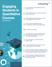
Enhancing Quantitative Courses With Varied Learning Approaches
Employing a variety of modes of instruction and assessment, as recommended by Universal Design for Learning (UDL) principles, can enhance the learning experience for students in quantitative courses. Diverse elements such as visual aids, interactive features, and real-world applications can complement, extend, or replace traditional lectures and exams. Since classes consist of students with varying learning preferences and strategies, using multiple modes of representation in a course promotes deeper understanding, engagement, and skill development. This piece details design elements that can be particularly impactful in quantitative courses.
Infographic Considerations
An infographic is a visual that combines text, graphics, diagrams, and graphs to present information. When used effectively, infographics can be a powerful tool to guide students through the learning process. “Infographics ask for an active response from the viewer, raising the questions, ‘What am I seeing?’ and ‘What does it mean?’” (Krauss, 2012, p. 10). Infographics also present information in an organized way, which can improve students’ critical thinking, analysis, and synthesis skills (Yildirim, 2016).
Quizzes for the Multimodal Course
From trivia games to final exams, quizzing tools have a variety of uses for learning as well as assessment. Exams and quizzes have a particularly plentiful range of possibilities in a multimodal or hybrid course, where they can be administered synchronously or asynchronously. Research suggests that the presentation of a tool influences student behavior in response to the tool. In comparing two student discussion boards, one an ungraded discussion and one a graded replacement for a final exam, Cheng et al. (2013) found that students displayed more knowledge on the graded board, but more evidence of learning on the ungraded board. The students who participated in the study were more likely to grapple with new ideas when the stakes were low, but more eager to showcase topics they were confident about when their responses would have a greater impact on their grades. When considering quizzing tools, then, we recommend allowing your course goals to guide your usage.
Communication, Community, and Student Engagement in the Online Classroom
The most difficult task in transitioning from on-ground to online teaching is determining the best way to emulate the community and engagement inherent in a face-to-face classroom.Consider this: Your online classroom can be even more engaging than an on-campus classroom. Simple tools, such as discussion forums and announcements, can elevate your classroom immensely.
Implementing Social Media
Many students use social media platforms in their daily lives, and “emerging evidence indicates that students express positive attitudes toward using social media for learning in general” (Baisley-Nodine, Ritzhaupt & Antonenko, 2018). However, there are also many concerns connected with using social media in an educational setting. These include issues related to a lack of familiarity with the platform, the potential for distraction, and privacy concerns. Therefore, it is important to carefully plan the use of social media in a course to address any potential issues or concerns.
Leveraging White Space
Good page design requires balance between white space, or negative space, and positive space. Positive space encompasses all aspects and types of content; on a course page, these objects might include an introductory paragraph, video thumbnail, infographic, callout box, opinion poll, or provocative quotation. Relative to these course components, white space might seem like a nice-to-have. Because it promotes clarity and reduces distortion, however, white space is just as important to instructional page design as content.


