Search
There are 21 results.
Tag
Tag
All (125)
Active Learning (4)
Activities (4)
Alt Text (2)
Analytics (4)
Animations (1)
Assessments (7)
Asynchrony (6)
Authentic Activities (2)
Backwards Design (2)
Belonging (3)
Canvas (10)
Case Studies (2)
Collaboration (5)
Color Contrast (2)
Communication (9)
Community (7)
Content Creation (12)
Copyright (2)
Course Maintenance (5)
Course Materials (7)
Course Preparation (6)
Discussions (5)
Diversity (5)
Equity (2)
Faculty Presence (3)
Faculty Support (3)
Feedback (8)
Formative Assessments (6)
Game-Based Learning (2)
Gamification (1)
Generative AI (2)
Grading (6)
Group Work (2)
Hyperlinks (1)
Images (3)
Inclusion (6)
Infographics (2)
Learning Objectives (3)
Multimodality (7)
Page Design (2)
Peer Review (1)
Podcasts (1)
PowerPoint (2)
Presentations (2)
Qualitative courses (1)
Quantitative courses (1)
Representation (1)
Revising (2)
Rubrics (4)
Scaffolding (1)
Screen Readers (1)
Social Media (2)
Summative Assessments (1)
Synchrony (8)
Third-Party Tools (2)
Universal Design for Learning (UDL) (2)
Video (12)
Visual Accessibility (2)
Visual Design (2)
Workload (1)
Written Assignments (1)
Improving PowerPoints
Sharing information via PowerPoint presentations is a long-established strategy in higher education. Designing PowerPoint presentations for online courses can pose unique challenges; however, best practices can help overcome these hurdles. With time and attention, faculty and instructional designers can create engaging and purposeful presentations with lasting value.
Communication, Community, and Student Engagement in the Online Classroom
The most difficult task in transitioning from on-ground to online teaching is determining the best way to emulate the community and engagement inherent in a face-to-face classroom.Consider this: Your online classroom can be even more engaging than an on-campus classroom. Simple tools, such as discussion forums and announcements, can elevate your classroom immensely.
Increasing Engagement with Q&A Forums
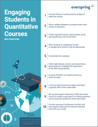
In online courses, opportunities for student engagement need to be deliberately designed (Martin & Bolliger, 2018). One common way to promote student engagement online is through discussion forums, for which there are widespread established best practices. However, the Q&A discussion forum, which is typically not graded or required, is often thrown into a course without clear intentions or structure. When purposefully designed, a Q&A forum can facilitate the crucial engagement types that are essential to building a community of inquiry in an online classroom, ultimately improving student satisfaction and learning outcomes. These engagement types are student-content, student-student, and student-instructor (Bernard et al., 2009 as cited in Martin & Bolliger, 2018). A Q&A forum should incorporate best practices around all three engagement types.
Leveraging White Space
Good page design requires balance between white space, or negative space, and positive space. Positive space encompasses all aspects and types of content; on a course page, these objects might include an introductory paragraph, video thumbnail, infographic, callout box, opinion poll, or provocative quotation. Relative to these course components, white space might seem like a nice-to-have. Because it promotes clarity and reduces distortion, however, white space is just as important to instructional page design as content.
Presentation Best Practices Guide
Many online courses focus on written communication skills, featuring discussion posts, papers, and case study reports among other assignments. However, oral communication and presentation skills are just as integral to students’ success, and, indeed, many employers list presenting as one of the most desirable skills for job candidates (Suhadi et al., 2021).


