Search
There are 19 results.
Tag
Tag
All (137)
Active Learning (4)
Activities (5)
Alt Text (2)
Analytics (4)
Assessments (9)
Asynchrony (6)
Authentic Activities (2)
Backwards Design (2)
Belonging (3)
Canvas (10)
Case Studies (2)
Collaboration (6)
Color Contrast (2)
Communication (10)
Community (9)
Competency-Based Education (1)
Content Creation (22)
Copyright (2)
Course Maintenance (5)
Course Materials (12)
Course Preparation (8)
Discussions (5)
Diversity (5)
Equity (2)
Faculty Presence (9)
Faculty Support (3)
Feedback (10)
Formative Assessments (7)
Game-Based Learning (2)
Gamification (1)
Generative AI (5)
Grading (7)
Group Work (2)
Images (3)
Inclusion (8)
Infographics (2)
Learning Objectives (3)
Multimodality (7)
Page Design (2)
Peer Review (1)
PowerPoint (2)
Presentations (2)
Qualitative courses (1)
Quantitative courses (1)
Representation (2)
Revising (2)
Rubrics (4)
Scaffolding (1)
Screen Readers (1)
Social Media (2)
Summative Assessments (1)
Synchrony (8)
Third-Party Tools (2)
Universal Design for Learning (UDL) (3)
Video (13)
Visual Accessibility (2)
Visual Design (2)
Workload (1)
Written Assignments (1)
Improving PowerPoints
Sharing information via PowerPoint presentations is a long-established strategy in higher education. Designing PowerPoint presentations for online courses can pose unique challenges; however, best practices can help overcome these hurdles. With time and attention, faculty and instructional designers can create engaging and purposeful presentations with lasting value.
Copyright
From time to time instructors may want to include in their courses copyrighted materials like images, print content, audio recordings, or videos. The University of Minnesota Libraries define copyright as “the area of law that deals with creation, ownership, sale, and use of creative and expressive works.”
Presentation Best Practices Guide
Many online courses focus on written communication skills, featuring discussion posts, papers, and case study reports among other assignments. However, oral communication and presentation skills are just as integral to students’ success, and, indeed, many employers list presenting as one of the most desirable skills for job candidates (Suhadi et al., 2021).
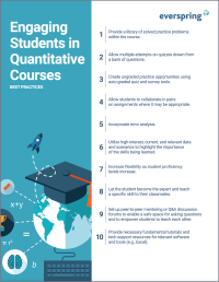
Enhancing Quantitative Courses With Varied Learning Approaches
Employing a variety of modes of instruction and assessment, as recommended by Universal Design for Learning (UDL) principles, can enhance the learning experience for students in quantitative courses. Diverse elements such as visual aids, interactive features, and real-world applications can complement, extend, or replace traditional lectures and exams. Since classes consist of students with varying learning preferences and strategies, using multiple modes of representation in a course promotes deeper understanding, engagement, and skill development. This piece details design elements that can be particularly impactful in quantitative courses.
Enhancing Student Learning Through Course Consistency and Accessibility
Course developers (those who build individual courses) play a crucial role in the success of an online degree program by providing expertise and bringing unique perspectives. Accordingly, it is valuable for faculty to customize their course spaces by infusing them with their own knowledge and personality. At the same time, it is also crucial to prioritize structural consistency within and across courses in an online program, as course consistency is a key aspect of accessibility and a key contributing factor to student success. In particular, students must be able to perceive, operate, and understand the course and course materials using program-standard devices and certain assistive technologies, and this should be true across all of the courses in a program. This is where program chairs and administrators can help support faculty in standardizing key elements of courses to facilitate a seamless student experience. In this piece, we discuss how maintaining structural consistency within and across courses can positively impact accessibility.


