Search
There are 19 results.
Category
Tag
Tag
All (124)
Active Learning (4)
Activities (4)
Alt Text (2)
Analytics (4)
Animations (1)
Assessments (7)
Asynchrony (6)
Authentic Activities (2)
Backwards Design (2)
Belonging (3)
Canvas (10)
Case Studies (2)
Collaboration (5)
Color Contrast (2)
Communication (8)
Community (7)
Content Creation (12)
Copyright (2)
Course Maintenance (5)
Course Materials (7)
Course Preparation (6)
Discussions (5)
Diversity (5)
Equity (2)
Faculty Presence (3)
Faculty Support (2)
Feedback (8)
Formative Assessments (6)
Game-Based Learning (2)
Gamification (1)
Generative AI (2)
Grading (5)
Group Work (2)
Hyperlinks (1)
Images (3)
Inclusion (6)
Infographics (2)
Learning Objectives (3)
Multimodality (7)
Page Design (2)
Peer Review (1)
Podcasts (1)
PowerPoint (2)
Presentations (2)
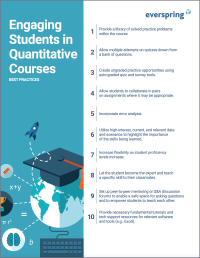
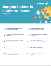
Qualitative courses (1)
Quantitative courses (1)
Representation (1)
Revising (2)
Rubrics (4)
Scaffolding (1)
Screen Readers (1)
Social Media (2)
Summative Assessments (1)
Synchrony (8)
Third-Party Tools (2)
Universal Design for Learning (UDL) (2)
Video (12)
Visual Accessibility (2)
Visual Design (2)
Workload (1)
Written Assignments (1)
Ten Ways to Open the Gate to Accessibility
According to the United States Census Bureau, over 57 million Americans, nearly one in five people in the U.S. population, report living with a disability. To make certain all your students can have a successful learning experience, it is important to take steps to make the online learning environment accessible. Find below ten strategies for making your online course space accessible to all users.
Don't Leave Your Learners Behind: Start Tackling Web Accessibility Now!
If you’re an educator, you're probably familiar with the concept of accessibility, which often manifests in the classroom in the form of accommodations requests to meet specific students' needs. If you're an online educator, you've hopefully heard about web accessibility, which requires adhering to specific guidelines when designing and providing materials via the web, reducing the need for student accommodations by anticipating and removing potential barriers to learning.
Infographic Considerations
An infographic is a visual that combines text, graphics, diagrams, and graphs to present information. When used effectively, infographics can be a powerful tool to guide students through the learning process. “Infographics ask for an active response from the viewer, raising the questions, ‘What am I seeing?’ and ‘What does it mean?’” (Krauss, 2012, p. 10). Infographics also present information in an organized way, which can improve students’ critical thinking, analysis, and synthesis skills (Yildirim, 2016).
Incorporating Multimedia in Your Course
Multimedia, which helps create an engaging and interactive online learning environment, has been shown to contribute to improved student performance (Cheng, Basu, & Goebel, 2009, p. 1). Though many online courses incorporate videos, they neglect to feature other forms of multimedia. And, while videos are a staple of multimedia use, there are other exciting options to consider: podcast episodes, graphics, and animations can all enhance course content, enriching the student experience. To maximize the benefits multimedia can provide, consider including these underutilized forms of multimedia in your course.
LMS Analytics: Supporting Your Students With Data
With the help of tools like Canvas New Analytics, faculty can leverage learning management system (LMS) data to hone their instructional techniques and improve their online students' experience. In this piece, we provide an introduction to learning analytics in online higher education and detail some analytics best practices.
Navigating Canvas New Analytics
At the end of 2019, Canvas rolled out New Analytics, a new version of their former analytics tool, Course Analytics. By Canvas' own description, New Analytics retains the core functionality of Course Analytics while offering a simplified user experience. In this post we share our recommendations for leveraging New Analytics to support students.
Taking Stock at the Midpoint of the Term
Halfway through the term isn't a great time to change around a bunch of materials or assignments in your course. However, it is a useful moment to evaluate how the course is going, realign to match the goals you set out at the beginning of the term, and determine what you may be able to tweak to make your course work more effectively for you and for your students. This piece suggests actions you can take at midterm to help shape the second half of the course.
Backward Design
Backward design is, as the name suggests, a process for designing curricula, courses, and lectures by working backwards from big-picture learning goals. The concept, introduced by Grant Wiggins and Jay McTighe (2005), suggests that instructors create assessments, activities, and course content that are explicitly aligned with the broader learning goals of the unit. This is different from the traditional content-driven approach to learning design, which focuses on course content first and only secondarily tries to align that content with learning goals.


